January 8th, 2025 | Posted in Tools
This analysis covers historical investment returns by asset class from 1985 to 2024, for a wide set of investments — including stocks / bonds in the U.S., Canada, and beyond.
This post was last updated on January 8, 2025 to include returns for the full year of 2024.
We’ll dig into questions such as:
- Does any investment asset class consistently outperform the rest?
- How do asset classes compare based on long-term average returns, minimum / maximum returns, and volatility?
- What were the best (and worst) investments of 2024?
- What is the correlation level between assets? For example, do bonds perform well when stocks go down?
The goal of this analysis is to understand how different investments have performed in the past, so that you can chart out an informed path ahead for your investment portfolio.
Armed with a good sense of how your investments might perform in the future, you can think through major financial plans or decisions — whether that’s renting versus buying your home, forecasting your retirement age, or just getting a general grip on where your net worth trajectory is headed.
A Universe of Investment Options
For those who’ve looked into historical investment returns, you’ve likely come across data based on the S&P 500 — an index that tracks the performance of the 500 largest publicly-traded companies in the U.S.
While the S&P 500 index covers the companies that feature prominently in American business news (Apple, Amazon, Microsoft, Google, JP Morgan, and the like), there’s a whole wide world out there that isn’t being covered. If you wanted to invest in technology companies in China, bonds in Europe, gold, or real estate, you won’t find those options in the S&P 500.
Broadly speaking, the ‘universe’ of investment options can be broken down by:
- Underlying asset type — whether that’s stocks, bonds, or other assets such as real estate, commodities, etc.
- Country — developed countries (such as the U.S., Canada, Germany) versus emerging markets (such as China, India, Brazil)
- Risk level — stocks of large mature companies versus small high-growth firms, government bonds versus high-yield / high-risk corporate bonds
For this analysis, we’ll stretch ourselves beyond the S&P 500 and take into account these 12 asset classes:
| Asset Class | Ticker | Description | # of Holdings | Risk Potential (out of 5) |
|---|---|---|---|---|
| US Large Cap Stocks | VFIAX | The S&P 500 index. 500 of the largest U.S. companies, which span many different industries and account for ~75% of the U.S. stock market’s value | 500 stocks | 4 |
| US Small Cap Stocks | VSMAX | Broad exposure to small-sized U.S. companies | ~1,400 stocks | 5 |
| International Developed Stocks | VTMGX | Exposure to large-, mid-, and small-capitalization companies in developed markets outside of the United States | ~4,000 stocks | 5 |
| Emerging Market Stocks | VEMAX | Stocks of companies located in emerging markets around the world, such as Brazil, Russia, India, Taiwan, and China | ~5,000 stocks | 5 |
| Canadian Stocks | XIC | Covers ~95% of the Canadian stock market. Canada’s version of the S&P 500. | ~200 stocks | 4 |
| All US Bonds | VBTLX | Exposure to U.S. investment-grade bonds. The fund invests in U.S. Treasuries and mortgage-backed securities of all maturities | ~10,000 bonds | 2 |
| Hi-Yield US Bonds | VWEAX | Diversified portfolio of medium- and lower-quality U.S. corporate bonds, often referred to as “junk bonds”. | ~600 bonds | 3 |
| International Bonds | VTABX | Exposure to non-U.S. investment-grade bonds. Track the performance of an index that includes international government, agency, and corporate bonds, mostly from developed countries, but also some emerging markets countries | ~6,000 bonds | 2 |
| Canadian Bonds | ZAG | Exposure to Canadian investment-grade bonds — consisting of Federal, Provincial and Corporate bonds. | ~1,200 bonds | 2 |
| Cash (T-Bill) | VUSXX | Invests in short-term U.S. Treasury bills, and other debts that are sponsored, guaranteed, or owned by the federal government | ~40 | 1 |
| REIT | VGSLX | Invests in real estate investment trusts – companies that purchase office buildings, hotels, and other property | ~200 REITS | 4 |
| Gold | IAU | Seeks to reflect the performance of the price of gold (in $USD) | 1 | n/a |
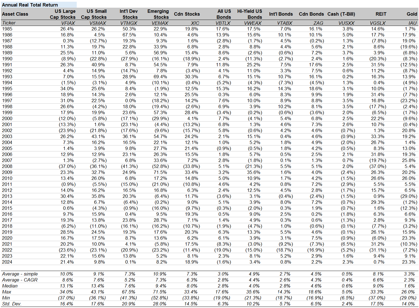
For each of the 12 asset classes, we’ll be working with the annual returns from 1985 to 2024 — a total of 40 years. Note that all returns in this analysis are the “real total return” values — meaning that they are adjusted to take into account inflation, and the re-investment of dividends. The values for 2024 are based on the full year values ended Dec. 31, 2024.
There’s quite a bit of data to process, and showing the raw numbers isn’t particularly helpful for digesting the information. Without further ado, let’s get started on slicing, dicing, and prettying up the data.
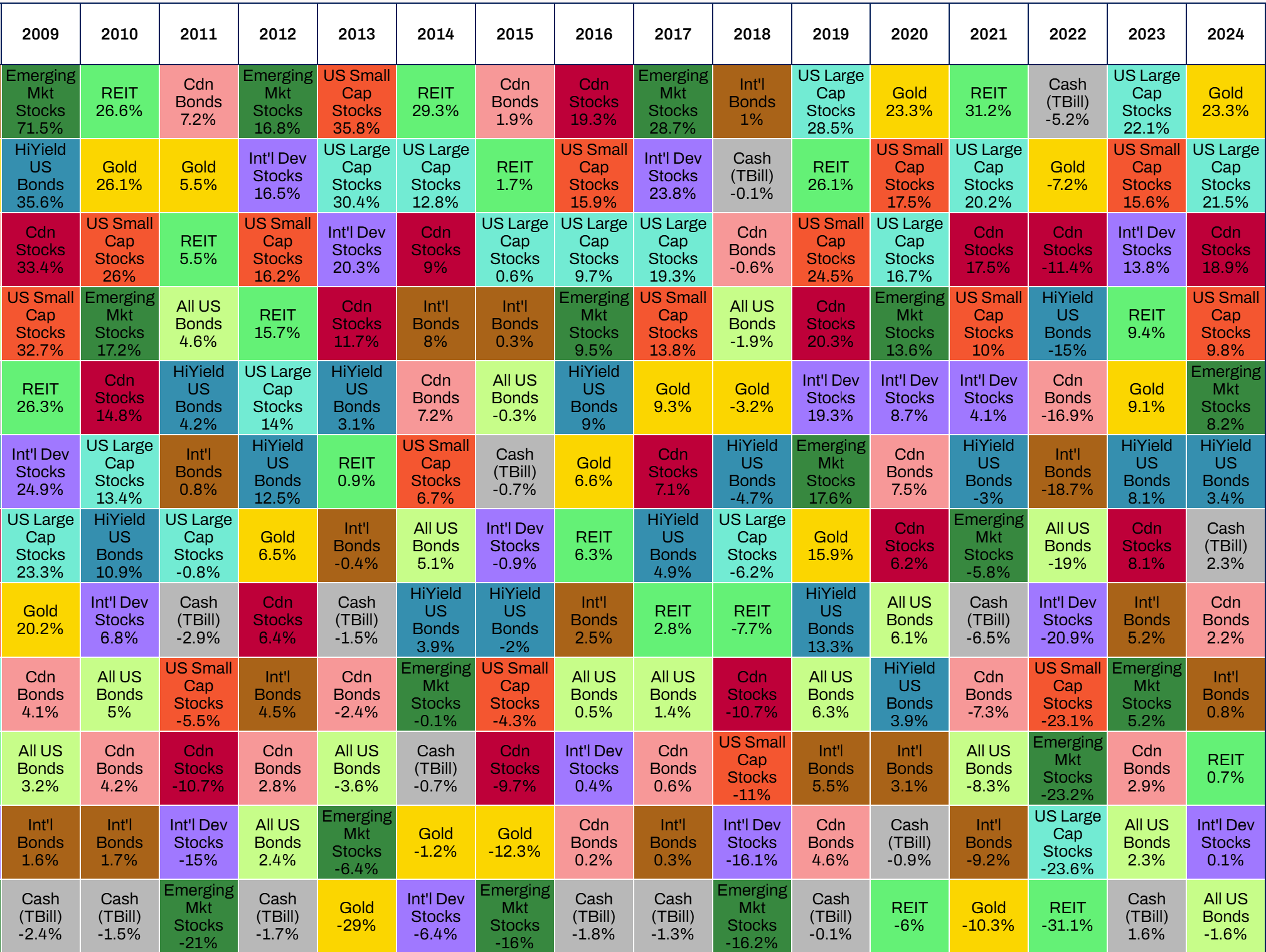
Periodic Table of Investment Returns by Asset Class
The table below shows the annual performance of each asset class. For each year, the values are shown in ranked order — the best performer appears at the top of the table, and the worst performer is at the bottom.
Hover your mouse over the cells in the table to highlight the returns of a single asset class. Scroll left to see data going back until 1985.
Note: The average in the last column shows the compounded annual growth rate (CAGR) for each asset class across all years (1985 to 2024). All values are real total returns, including dividends / inflation.
It’s no easy feat to pick the winner in a given year. The asset class rankings appear to be randomly tossed about over time, with the top performer in one year often falling down to the middle or bottom of the table in the next year.
11 out of 12 of the asset classes have been a top performer in at least 1 year on record (high yield US bonds being the odd man out). On the flip side, 9 out of 12 of the asset classes have been the worst performer at some stage (Canadian stocks, Canadian bonds, and high yield US bonds being the only assets to avoid the dishonour).
Now the same data is presented, but in a more traditional line chart format. While the periodic table format above does a good job of showing the ranked order (which asset class was first, second, third…), the chart below helps us to visualize the absolute values and the gap between asset classes (how much better the first asset was compared to the second).
Click the asset class labels in the chart legend to toggle them on/off from being displayed.
It’s interesting to see how “US large cap stocks” have performed relative to “All US Bonds” over time. While stocks were down in the years of 1990, 2000-2002, and 2008, bonds actually made gains in those years — this provided valuable portfolio protection to investors who were diversified.
However, notice how this inverse relationship broke down in 2022, with stocks and bonds both suffering heavy losses. This meant that a typical 60/40 portfolio fared poorly in 2022. Unfortunately, keeping your eggs in multiple baskets doesn’t always pay off.
Which Investment Asset Classes Have the Highest and Lowest Returns?
Over the whole period of our analysis (1985 to 2024), the best asset classes were:
- U.S. large cap stocks: +8.6% per year (annualized real total return)
- U.S. small cap stocks: +7.6% per year
- Emerging market stocks: +7.3% per year
At the bottom of the list, the worst performing asset classes were:
- International bonds: +2.6% per year
- Gold: +2.3% per year
- Cash (T-bills): +0.4% per year
As a reminder, all values shown are real total returns, including dividends / inflation.
Unsurprisingly, stocks come out on top in terms of pure investment returns, while bonds and other assets lag behind. This data demonstrates the investing cliché that “higher risk leads to higher returns”.
A Bit About Bitcoin
Keen eyes and crypto-conscious readers may have noticed that Bitcoin does not appear in any of the statistics above. I feel compelled to address this, given the exponential gains in value / popularity of cryptocurrencies in recent years.
Bitcoin has a relatively short trading history, with market pricing for Bitcoin only starting in 2010. In contrast, this post analyses asset class returns going back to 1985.
The total market capitalization of Bitcoin is “only” ~$2 trillion USD at the time of writing (January 2025), which is actually quite small compared to other investment asset classes. By contrast, the US stock market has a total market cap of ~$54 trillion USD (~27x larger than Bitcoin).
With that in mind, Bitcoin is still a new asset and a relatively small asset in the grand scheme of things, and it could be argued that it should be compared against specific single-company stocks (like Nvidia, Apple, or Tesla) rather than against broad stock / bond markets as a whole.
All that being said, it’s becoming increasingly tough to ignore the performance of Bitcoin / other cryptocurrencies. Here is a summary of Bitcoin’s performance in recent years and how it would stack up against the major asset classes being tracked in this post:
- 2024: +122% (best performing asset)
- 2023: +155% (best performing asset)
- 2022: -64% (worst performing asset)
- 2021: +60% (best performing asset)
- 2020: +303% (best performing asset)
Bitcoin’s price is incredibly volatile, and would fall either at the top or bottom of the rankings in all recent years.
Let me know your thoughts about Bitcoin and whether you think it belongs in this asset class ranking — I’d love to hear your feedback in the comment section below.
Next up, we’ll take a closer look at the performance of the asset classes by year, and a deeper dive on volatility and correlation levels.
Year in Focus
Use the drop-down menu below to zoom in on a single year. The investment returns for each asset class in that year will be shown.
This allows us to focus on specific events in market history — such as the great financial crisis of 2008, when stocks plunged by 30-50%, while bonds and gold actually recorded slight gains.
| Year: |
The Best and Worst Investments of 2024
2024 saw strong returns for Gold and North American Stocks, while Bonds / Real Estate / International Stocks struggled:
- 11 out of 12 asset classes increased in value in 2024 (on a real total return basis), “All US Bonds” was the only asset class with negative returns
- Gold was the top performing asset of 2024, returning +23.3% (real total return) — this was driven by purchases from central banks in countries such as China / India / Russia, alongside geopolitical uncertainty in Ukraine and the Middle East
- American Large Cap stocks (+21.5%) were the runner-up, driven by stellar performances from tech companies like Nvidia, Meta (Facebook), Tesla, and Amazon
- Somewhat surprisingly, Canadian Stocks (+18.9%) took 3rd place, led by strong returns from large Canadians companies such as Shopify, Royal Bank, CIBC, and Brookfield
- In contrast, REITs (+0.7%) and International Developed Stocks (+0.1%) had weak returns
- “All US Bonds” (-1.6%) was the worst-performing asset class of 2024
The Best and Worst Investments of 2023
2023 was a year of strong investment returns, where asset prices rebounded strongly after suffering large declines in 2022:
- All 12 of our tracked asset classes increased in value in 2023 (on a real total return basis)
- An investment in U.S. large cap stocks was the top performing asset of 2023, returning +22.1% (after suffering a loss of 23.6% in the previous year)
- Global stocks outside of the U.S. delivered relatively weaker returns (compared to the U.S.) — with International stocks at +13.8%, Canadian stocks at +8.1%, and Emerging market stocks at +5.2%
- Cash was the worst investment of 2023, returning only 1.6% on an inflation-adjusted basis
The Best and Worst Investments of 2022
2022 was a topsy-turvy and primarily painful year for investors:
- All 12 of our tracked asset classes declined in 2022 (on a real total return basis)
- The biggest driver of these losses was red-hot inflation — with roughly 7% inflation over the year — spurring stern central bank responses via interest rate hikes
- An investment in cash (through U.S. T-bills) was the top performing asset of 2022. However, the real total return was still a decline of 5.2%
- Real estate (through REITs) was the worst investment of 2022, with a loss of 31.1%. Higher mortgage rates and commercial real estate vacancies drove the significant decline
- 2022 saw stocks and bonds drop hand-in-hand by roughly 20%, much to the despair to traditional 60/40 investors
- Canadian stocks offered relative respite for investors, declining by “only” 11.9%
Single Asset Class Deep Dive
Use the drop-down menu below to focus on one asset class at a time.
The bottom chart in this section shows the range of returns using short, medium, and long-term time horizons. The potental range of outcomes is very wide when you look at returns over only 1 year, but the range narrows and becomes more predictable as the time horizon gets longer.
| Asset Class: |
| Summary Metrics | |
|---|---|
| Average | |
| Median | |
| CAGR | |
| Max | |
| Min | |
| Standard Deviation | |
Correlations Between Investment Returns by Asset Class
The chart below shows the correlation level between each pair of asset classes, over the whole analysis period.
The values shown are correlation coefficients (a.k.a., Pearson’s R values) that measure the strength of the relationship between each pair of asset classes. A value of 1 indicates a strong positive relationship; a value of -1 indicates a strong negative relationship; a value of 0 indicates no relationship between the two asset clsses.
A few takeaways here:
- All categories of stocks have fairly high correlation with each other (values close to 1)
- Bonds have minimal correlation with stocks (values closer to 0)
- Gold has a slight negative correlation with some of the other assets
| US Large Cap Stocks | US Small Cap Stocks | Int’l Developed Stocks | Emerging Market Stocks | Canadian Stocks | All US Bonds | High-Yield US Bonds | Int’l Bonds | Canadian Bonds | Cash (T-Bill) | REIT | Gold | |
|---|---|---|---|---|---|---|---|---|---|---|---|---|
| US Large Cap Stocks | ||||||||||||
| US Small Cap Stocks | ||||||||||||
| Int’l Developed Stocks | ||||||||||||
| Emerging Market Stocks | ||||||||||||
| Canadian Stocks | ||||||||||||
| All US Bonds | ||||||||||||
| High-Yield US Bonds | ||||||||||||
| Int’l Bonds | ||||||||||||
| Canadian Bonds | ||||||||||||
| Cash (T-Bill) | ||||||||||||
| REIT | ||||||||||||
| Gold |
Final Thoughts, Notes & Sources
And that’s a wrap.
After sifting through a heap of data, my key takeaways are:
- It’s hard (perhaps impossible) to predict which asset class will be the best performer in any given year. There doesn’t seem to be a rhyme or reason to the annual rankings
- Investment returns are far more reliable if you have a long time horizon. The risk of losing money is much higher if you’re only investing over a 1-year period, rather than a 5, 10, or 20-year period
- Diversification has clear benefits. Allocating a portion of your portfolio towards bonds will often cushion your losses in years when stocks tumble.
All in all, it’s my firm belief that the optimal investing strategy relies on a few simple steps — invest in a diversified passive portfolio, stay invested over the long-term, and re-balance when necessary.
If you liked this post, you may be interested in some of my other tools and data essays:
- Free spreadsheets and tools for budgeting, investment portfolio tracking, and more
- US stock market returns — a history from the 1870s up to today
- Tracking Canadian Housing Market Affordability (1999 up to today)
- The Wealth of Nations: income, cost of living, and purchasing power for 110 countries
That’s all for now! Thanks for joining me on this data deep dive 🧐. Feel free to drop any comments or questions below.
—
The periodic table format was created by Jay Kloepfer of Callan in 1999.
Data was sourced from Yahoo Finance, Vanguard, iShares, Libra Investment Management, and the Bogleheads forum. All of the data used in this article can be downloaded here in spreadsheet form.
Note 1: this post was first published on November 15th, 2020. The latest update occurred on January 8, 2025.
Note 2: All return values shown in this post are real total returns (adjusted for inflation and the re-investment of dividends). Returns are tracked in local currency (i.e., changes in foreign exchange rates are not included).
Great analysis! The interactive tools are very useful.
You mentioned stock volatility over the long run being more reliable, so I was wondering what you think of Prof. Lubos Pastor’s 2009 paper regarding long term stock volatility?(https://www.nber.org/papers/w14757)
He has a YouTube video explaining it quickly, but essentially he found that over the long term, stocks are actually quite a bit more volatile than conventional wisdom suggests. Do you think this research should change how investors plan their portfolios?
Hi Kevin,
Thanks for sharing that paper, I hadn’t seen it before. I confess that I don’t fully grasp the concepts — I think I would need to go back to school for several more years and then revisit 🙂
That being said, I did come across these links which are put more in layman’s terms:
https://www.youtube.com/watch?v=r5Mbt7FeKAQ
https://www.advisorperspectives.com/articles/2011/06/28/an-important-challenge-to-stocks-for-the-long-run
If I understand the argument correctly, Professor Pastor is saying that the idea that “stocks are less risky in the long-run” has been true if we look backwards — however — if we look forwards this is no longer the case.
The long-term real total return for stocks has been roughly 7% in the past, but in the future the long-term average could be 3% or 10%. Therefore, since we don’t know what that long-term future average is, the volatility actually grows over time as we look at longer and longer horizons!
It’s an interesting argument. I’m not sure if I agree with it, but then again I’m just a stranger on the internet without a PhD in finance.
The natural conclusion of Prof. Pastor’s argument seems to be that investors with long time horizons should not have 80 to 100% of their portfolio in stocks. Perhaps a 60/40 allocation between stocks and bonds would be better?
Thanks again for sharing. Lots of food for thought.
Thanks for responding. I sort-of grasp the concepts I think.
Just thought it would be interesting to share as I heard some people discussing it on a finance podcast.
At the end of the day I don’t really think it changes much, because there is no real alternative options to equity that will get you that high of an expected return.
Outstanding. We love statistics. Understanding long term returns, standard deviations and correlations is critical when choosing an asset allocation. thanks
Cheers, thanks Georgia.
[…] Datenbasis für meine Auswertungen stammt aus dem Artikel Investment Returns by Asset Class (1985 to 2020). Der Artikel Ranking Asset Classes by Historical Returns (1985-2020) auf Visual Capitalist […]
This is great analysis and article. Thank you so much!
Cheers — you’re welcome, and thank you!
Excellent Article. Thanks for sharing your analysis. I wondered if you did a “hind sight 2020” besc mix for this extended period. i.e. what would ‘have been’ the best mix over say 10, year 20 year historical timespan. I would love to do that and may even attempt on my own, but unfortunately I am not as mathematically gifted as you sir. Thanks for the great article once again. Appreciated.
Hi Som,
I haven’t done that type of back-testing analysis, but it’s a nice idea. Could even expand the analysis to try to find the portfolio which generates the lowest volatility, or a perhaps an “optimal” mix of high returns and low volatility.
Of course, any back-testing analysis is fraught with flaws, but it’s an interesting thing to try nonetheless.
I’ll think more on this and perhaps update the article down the road with my findings.
Thanks for the comment!
[…] que pior desempenhou mostrou ao longo do ano que agora terminou. Segundo dados retirados do site The Measure of a Plan, os REIT’s desvalorizaram 5,8% em […]
[…] particular, look at their 35-year asset quilt here. You can find a data chart and some graphs that will give you a quick lesson on what volatility […]
Hi there, love your work!
I think you need to update the 2020 inflation numbers in your Annual Real Total Return chart. Appears you are using the 1.2% projected in Dec, but it came in at 1.4%.
Richard
Curious where you got the performance figures for VTABX, since the fund was created I think in 2013. Also, you should include VIMAX for Mid-Cap stocks in your line up!
Thanks Richard for your comments.
I’ll update for the final inflation number in the next go around.
For the VTABX fund, I got those returns from the Bogleheads forum — they’ve got a great spreadsheet filled with historical returns for various asset classes. Unfortunately, not immediately obvious to me where the VTABX data was sourced from pre-2013.
https://www.bogleheads.org/wiki/Simba%27s_backtesting_spreadsheet
And thank you for the mid-cap recommendation, I’ll consider it for the next version.
Cheers and thanks again for your thoughtful comments.
[…] Investors can choose from a wide variety of investments. In the design of the right Investment Portfolio, it is important to know and understand the past performance of each asset class. This charts provides some references. This analysis includes assets of various types, geographies, and risk levels. It uses real total returns, meaning that they account for inflation and the reinvestment of dividends. The Graph is inspired by and uses data from The Measure of a Plan. […]
Thanks for sharing this Great insightful analysis.
I would love to see how crytpo would fit into this list as possible futuristic asset class.
Although it started in 2013 and it look like as in its nest in comparison to gold for example.
Very insightful analysis, thank you ever so much for sharing this.
Why is it that the Cash (T-Bill) returns are negative? Is it due to the inflation adjustments?
Also- as a humble suggestion, a useful index to track moving forward is the NPI from the NCREIF. This index tracks the performance of core institutional property markets in the U.S. It’s an excellent comparison to REIT, with historically one of the best Sharpe Ratio across all investment asset classes.
Hi Mike,
Yes that’s right, Cash shows a negative return in some years due to the impact of inflation.
What kind of programming language do you use for the interactive asset return chart and graph? It is amazing artwork.
Hi Chris,
I’ve built this post with html/css/javascript. The line and bar charts are built with chart.js
Thanks for the kind words 🙂
Are you going to update this table for ~2021?
I look forward to your new post
Hi,
I really love this table view of assets. With a Canadian focus also! Do you plan to update it for 2021? Please?
Thanks!
Hi Serge and Chris. Sorry for the very late response.
This post has now been updated with data going up until Q1 2024.
[…] When you follow this formula, maximizing cash inflows (while maintaining your priorities) and minimizing cash outflows (within reason), you will soon wind up with a large and growing pile of savings. This is your wealth-creating tinder. With it, you will begin to plant the seeds which will one day become your oak tree-sized fortune. You must invest the excess cash savings in assets which you understand and provide solid returns given their risk profile (while always remembering to avoid critical path zeros). For some people this may be real estate. For others it will be side projects or small business ownership. I am partial to common stock investing (barring abnormal opportunities in other areas), given my experience and background in analyzing stocks (and also given their long-term empirical returns). […]
[…] usage of knowledge from The Measure of a Plan and SSA.gov, we measured the typical annual go back of quite a lot of various kinds of belongings. […]
[…] data from The Measure of a Plan and SSA.gov, we measured the average annual return of a variety of different types of assets. The […]
[…] knowledge from The Measure of a Plan and SSA.gov, we measured the typical annual return of quite a lot of various kinds of property. The […]
[…] data from The Measure of a Plan and SSA.gov, we measured the average annual return of a variety of different types of assets. The […]
Excellent information. Clean output and views. Nice Excel skills.
Also, I am trying to use similar graphics tools in my WordPress blog. Can you share what tools (plugins, programs) you are using for your graphics generation and what do you have to do to make sure the graphics views get adjusted so they are also fully viewed on a mobile phone screen (I assume the same graphics plugin allows for this) ?
Thanks so much for any information you can share.
[…] used some mutual fund data from Themeasureofaplan.com. I did my own excel calculations but some of the formats and computations are based on the great […]
[…] data analysis and comparison, stocks have given the highest average investment return from 1985 to 2020. So, the U.S. share market outperformed all the other asset types. After that, real estate, mutual […]
[…] Read More […]
[…] Investment Returns by Asset Class (1985 to 2022) […]
[…] Measure of a Plan has updated the investment returns by asset class from 2010-2022. The best (or least bad!) asset in 2022 was short-term treasury bills at -5.2%. The […]
[…] Measure of a Plan has updated the investment returns by asset class from 2010-2022. The best (or least bad!) asset in 2022 was short-term treasury bills at -5.2%. The […]
[…] Here’s a breakdown of how annualized total returns fared over various time frames, according to the data analyzed by The Measure of a Plan: […]
[…] Investment Returns by Asset Class (1985 to 2022) […]
[…] дали самый высокий средний доход от инвестиций из с 1985 по 2020 год. Таким образом, рынок акций США показал себя лучше […]
[…] informação retirada do site The Measure of a Plan, o investimento em REIT’s ao longo de 2022 resultou numa desvalorização do capital investido de […]
You say, “Note that all returns in this analysis are the “real total return” values — meaning that they are adjusted to take into account inflation, and the re-investment of dividends.”
Does this mean that the displayed values are boosted by the benefit of DRIP? Or does it mean that they reflect the return without any benefit of DRIP?
Hi Jerome,
This data includes the effect of dividend re-investment, meaning that the returns have indeed been boosted by the benefit of DRIP.
Such a wealth of info here in one chart…..Have you thought of adding an OIL sector? Maybe Oil majors for a start…
Thanks Bob. I’ve just updated this post with data up until Q1 2024.
I’ll look to add Oil as an asset class in a future version. Cheers.
[…] For example, here are the historical returns for common asset classes: 1Source: The Measure of a Plan […]
[…] Investment returns by asset class (1985 to 2024) […]
[…] Investment returns by asset class (1985 to 2024) […]
[…] Investment returns by asset class (1985 to 2024) […]
Thought provoking as usual. Thanks.
I am wary of the definitions of risk. All are based on short term one year returns. And for short term time horizons, the article is completely relevant. Not so much for long term investors except for the last chart showing S&P 500 performance over longer periods.
Your summary comment: ” investment returns are far more reliable if you have a long time horizon. The risk of losing money is much higher if you’re only investing over a 1-year period, rather than a 5, 10, or 20-year period” is only half right however. This applies to assets that are riskier in the short term. Assets on the “low risk” end like T-Bills, so dramatically underperform over the long term that they present the greatest shortfall risk for a long term investor. T-Bills are actually GUARANTEED to lose as they rarely beat inflation over longer periods. Likewise, Junk Bonds almost double returns of all other bonds and even more so against Government bonds over longer periods like 20 years (20yr CAGR for VWEAX 5.59% vs 2.89% for VBTLX).
In most instances, studies highlighting 1-year returns do long term investors a disservice by showing risk that should not apply to them and sway them into assets that will actually hurt their long term performance. Remember bonds in 2022? 10 years of gains wiped out in short order on the side of the portfolio that was supposed to protect them.
The tragedy of the balanced portfolio model for long term investors is chronic underperformance that has left so many retirees with underfunded retirement savings. Fixed income and diversification is critical, but not to the level taught by academics for the last 70 years – primarily because short term returns are used to dictate long term asset allocations.
Thank you Robert for your thoughtful comment.
Of course you are correct that stocks have outperformed all other asset classes over the long term (20+ years). If risk is to be defined as having lower performance over the long-term, indeed cash and bonds are actually higher risk investments (compared to stocks).
Your argument is similar to the one that Jeremy Siegel raises in his book “Stocks for the Long Run”.
Thanks again for your comment.
A what market cap will you start to include Bitcoin?
Hi Tristan,
I don’t have a specific market cap threshold in mind. Bitcoin is a relatively small asset, with a relatively short trading history, and it’s not clear that it belongs in an asset class comparison versus broad stock market / bond market averages.
It could be argued that Bitcoin is better compared against individual stocks like Nvidia, Tesla, Google, etc. — or against commodities like copper.
That being said, I’ll continue to monitor Bitcoin and perhaps will include it in this analysis the next time I update.
Cheers.
You should look at the CAGR of Bitcoin over the past decade. It is well beyond any other asset class. I haven’t checked today but CAGR is in the 55% to 65% range over the past 10 years. It is unwise to ignore this asset. A 5% to 10% allocation with a mix of stock index funds and treasury bills can provide excellent returns.
[…] Source: https://themeasureofaplan.com/investment-returns-by-asset-class/ […]