October 1st, 2024 | Posted in Data & Insights, Tools
In this post, we’ll walk through a map of global wealth — with data on incomes, cost of living, and purchasing power across 110 countries.
The data is visualized below in three ways: a geographic map, scatterplot chart, and a tool to compare countries head-to-head.
Using this data, we can answer questions such as:
- Which countries have the highest and lowest incomes in the world?
- What is the average cost of living in my country, and how does that compare to nearby countries?
- If we adjust a country’s average income by the cost of living, which countries are richer and poorer?
The data is sourced from WorldData.info based on the year of 2023.
All data is shown as a relative index, where the value for the United States equals 100. An index value of 120 means “20% higher than USA”, while an index value of 75 means “25% lower than USA”.
Map of Global Wealth (Income, Cost of Living, and Purchasing Power)
Use the map below to explore data across the globe. You can scroll and zoom to see more countries.
Hover/click on any country for more info.
The drop-down menu lets you choose between analysing cost of living, income, or purchasing power [1]. Countries are color-coded based on their index value (brighter colors = higher values).
Note [1]: “Purchasing Power” is a metric that takes into consideration both income and cost of living, to determine whether one country is richer/better off than another country.
For example, average income in Switzerland is 19% higher than average income in the USA. However, cost of living is 26% higher in Switzerland. Therefore, on a purchasing power basis, people in Switzerland are ~6% poorer (they can buy less goods and/or save less than the average American).
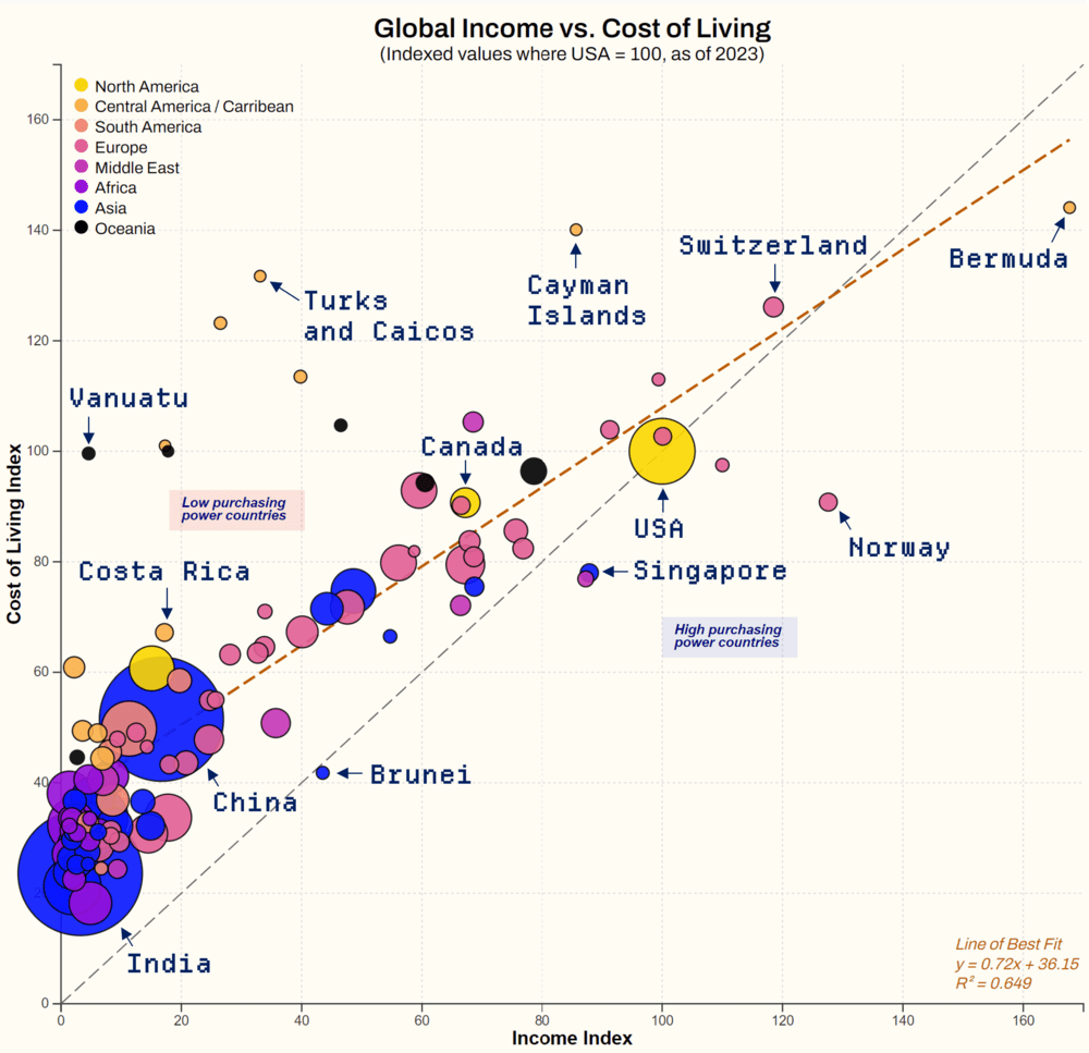
Scatterplot Chart — Income versus Cost of Living by Country
The scatterplot chart below compares incomes against cost of living for all 110 countries in the dataset. Each country is represented as a dot, where the dot is color-coded by world region and sized based on population.
Hover/click on any dot for more info.
The “average incomes” used in this analysis are calculated using an arithmetic mean.
The average income of a country is computed using gross national income (GNI) and the population of the country. Dividing all earnings/profits of the country (i.e., GNI) by the total population gives the average income per person.
Please note that this includes wages/salaries, but also other income, such as capital gains and dividends.
As many readers are probably thinking, “average income” is a flawed metric that doesn’t do a good job of adjusting for income inequality. I’m absolutely in agreement with that.
Median income would be a preferred metric to use for this. If you know of a reliable data source for median incomes across most countries in the world, please let me know and I will adjust accordingly. As it stands, this is the best data I was able to find.
Head-to-Head Country Comparison
Select any two countries below, and the table will provide a head-to-head comparison of the income, cost of living, and purchasing power in those countries.
This table can be useful for getting a sense of the cost of living in another country, whether you’re interested to visit for tourism or plan to make a longer-term move.
Note: these are relative index values as of 2023, where USA = 100
| (A) | (B) | (A vs. B) | |
|---|---|---|---|
| Country | |||
| Cost of Living | |||
| Income | |||
| Purchasing Power | |||
As a reminder, “purchasing power” is a metric that uses average income and average cost of living, to determine whether one country is wealthier / better off than another country.
Of course individual circumstances will vary, but this metric is useful as a directional sense of whether the citizens of one country can buy more goods / save more money, on a broad average basis.
Full Data Table
The full dataset is presented below. Click on any of the column headers to sort by ascending or descending order.
Note: these are relative index values as of 2023, where USA = 100
Sources, Notes, and Closing Remarks
The data is sourced from WorldData.info based on the year of 2023. This has been compiled based on data from the OECD, World Bank, IMF, and Eurostat.
Mapping was done using the leaflet.js library, together with mapping tiles from OpenStreetMap.
The scatterplot chart was created using the d3.js data visualization library.
If you liked this post, you may be interested in some of my other tools and data essays:
- Free spreadsheets and tools for budgeting, investment portfolio tracking, and more
- Investment returns by asset class (1985 to 2024)
- US stock market returns — a history from the 1870s to 2023
That’s all for now! Thanks for joining me on this data deep dive 🧐. Feel free to drop any comments or questions below.
This is an incredible data visualization! Makes it easy to pick out global outliers like Bermuda / Cayman Islands / Norway.
Great work
Thank you! Yes I feel that a scatterplot really shines when there are outliers in the dataset.
Really beautiful presentation of the dataset — bravo.
d3.js is a really great library for data viz
Much appreciated! It was a bit of a tricky learning curve for the d3 basics, but it’s really fun to use afterwards. Customizable everything!
Very neat.
Thanks for taking the time!
Amazing work!
Thank you David, much appreciated.
Fascinating as always. Was an interesting exercise over the weekend — I’m using it for preliminary planning on lower cost retirement destinations.
[…] The Wealth of Nations: income, cost of living, and purchasing power for 110 countries […]
This is quite nice but I feel like it would be a bit more informative as a log-log plot. It doesn’t really look like a line fit is a good match, and the bunching near zero makes it hard to see what the low-income behaviour is really like. I do appreciate making the data available so I can do it myself though!
Thanks Matthew. Great feedback. Agreed that a log plot would be useful — I’ll try to add that in the next version
[…] The Wealth of Nations: income, cost of living, and purchasing power for 110 countries […]
Obviously such data is highly inaccurate and skewed towards high income.
A more accurate median income and cost of living index based on local currency can be made.
Since most countries produce many of their own products and services consumed locally, this would be more accurate reflection of the PPI.
Should not use another country as the base for comparison as every country has their local costs.
The information you presented is definitely skewed upwards by exchange rate, none local factors.
The following table uses only local currency without using other country as a base to avoid exchange rate, non local inputs, expenditures and costs to better reflect actual affordability of income over costs of living.
For the sake of this table, I will use assumed values for median income and median cost of living for each country. Please adjust these values based on the most accurate and current data available for your needs.
Country Population (millions) Median Income (Local Currency) Median Cost of Living (Local Currency) Purchasing Power Index (PPI)
United States 335 $75,000 USD $75,000 USD 100.00
Canada 39 $65,000 CAD $60,000 CAD 108.33
United Kingdom 67 £55,000 GBP £50,000 GBP 110.00
Germany 84 €60,000 EUR €55,000 EUR 109.09
France 65 €50,000 EUR €45,000 EUR 111.11
Italy 60 €45,000 EUR €40,000 EUR 112.50
Switzerland 8.5 CHF 90,000 CHF 80,000 112.50
Australia 26 $70,000 AUD $65,000 AUD 107.69
New Zealand 5 $60,000 NZD $55,000 NZD 109.09
Singapore 5.7 SGD 80,000 SGD 75,000 106.67
Japan 125 ¥6,000,000 JPY ¥5,500,000 JPY 109.09
South Korea 52 ₩50,000,000 KRW ₩45,000,000 KRW 111.11
Thailand 70 ฿300,000 ฿400,000 75.00
Malaysia 33 RM 66,000 RM 60,000 110.00
Philippines 113 ₱36,000 ₱50,000 72.00
Indonesia 276 Rp 60,000,000 Rp 40,000,000 150.00
Brazil 213 R$ 10,000 BRL R$ 15,000 BRL 66.67
Mexico 126 $180,000 MXN $150,000 MXN 120.00
The figure understate the income RM12,000 per year for malaysia by a huge amount.
The monthly income already exceeded that at min RM5-6000/mth.
On the other hand, Singapore income is overstated at $80,000 pa and works out to more than and does not match the household income. This should be under $5500/mth
I found this looking for international purchasing power comparisons. Yours is the only one I’ve found so far, as I didn’t want QofLife health, education etc included. Like the presentation. Shame median income data can’t be sourced. Thanks very much for your work.