April 7th, 2019 | Posted in Data & Insights, Real Estate

Home-ownership is a term that comes with its fair share of baggage. Depending on who you’re speaking with, it can be one of several things: an ideal to strive towards, a dream that’s simply out of reach for those without hefty incomes, or a downright terrible investment.
To cut through the vague generalizations that always seem to surround the world of real estate, this post will dive into a history of home prices in North America, including:
- Long-term trends on inflation-adjusted home prices in the U.S. (starting in the 1890s!) and in Canada (starting in the 1990s)
- Total % growth / annualized growth rates over time
- Regional analysis, which breaks down the national averages into data for each major city (19 cities in the U.S.; 11 cities in Canada)
Whether you’re a renter, owner, investor, or bystander — I hope that you’ll come away from this post armed with an appreciation of the history of home prices in North America, and the confidence to chart a course forward.
A History of Home Prices in the U.S.
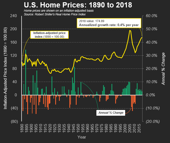
The chart above gives us a bird’s eye view of the data.
The yellow line shows the average price of a home in the U.S. over time, on an inflation-adjusted basis, and indexed to the year 1890 (where the price in 1890 is equal to a value of 100).
The green / orange bars show the annual % change in average U.S. home prices for each year. Contrary to semi-popular belief, an investment in real estate isn’t always a safe and steady one — historically, there have been several multi-year periods of negative returns.
The data-set used to create this chart was painstakingly assembled by professors Karl Case and Robert Shiller (winner of the 2013 Nobel prize in Economics), and is calculated based on repeat-sales of single-family homes. This means that the data only includes homes which have been sold at least twice, which allows for price comparisons on an apples-to-apples basis.
In short, U.S. homes (on average) have not been a fantastic investment, with annual returns barely outpacing the rate of inflation.
Over the 128 years covered by the data-set, the index moves from a value of 100 to ~175. In other words, the average U.S. home generated an average annual return (a.k.a. compounded annual growth rate) of 0.4% per year.
In comparison, over a similar period covering the late-1800’s to today, U.S. stocks have generated a return of nearly 7% per year (on an inflation-adjusted basis).
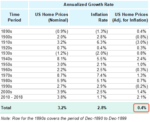
The table above breaks down the history of home prices in the U.S. into decade-by-decade chunks. The columns show the change in home prices on a nominal basis (before adjusting for inflation), the rate of U.S. inflation, and the resulting change in home prices after adjusting for inflation.
Large increases in home prices on a nominal basis tend to coincide with periods of high inflation (e.g., the 1970s and 1980s).
Overall, U.S. home prices have increased by 3.2% per year on a nominal basis. After adjusting for the average inflation rate of 2.8% per year, we get back to the same spot as before, with U.S. homes increasing by ~0.4% per year in real dollar terms.
While broad national average figures give us quick indications and nice headlines, the devil often lies in the regional details.
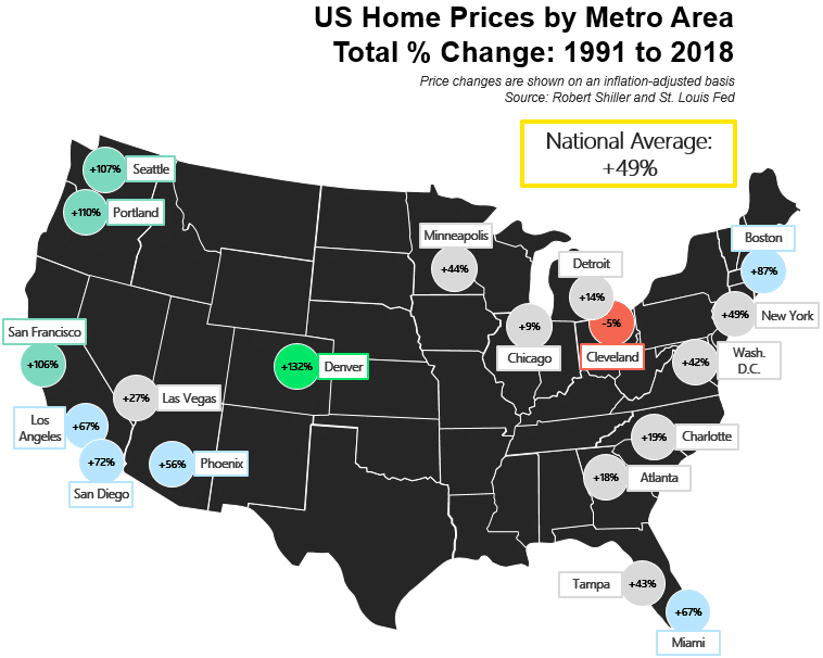
Thanks once again to Professor Robert Shiller, we also have access to U.S. home prices broken down to a metro-area level.
The map above shows the total percentage change in home prices in 19 cities, from the period of 1991 to 2018.
On a national basis, home prices increased by 49% on average over those 27 years.
However, cities on the West coast — Seattle, Portland, San Francisco, LA, and San Diego — have seen much sharper price increases compared to cities on the great lakes or the East coast.
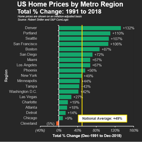
Sorting the 19 cities from high to low, we can see Denver leading the pack (+132% in total from 1991 to 2018), while Cleveland is the only city where home prices actually decreased over those 27 years (down by 5% in total).
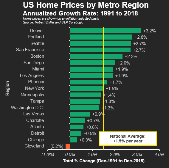
On an annualized growth rate basis, we see that most cities had an average growth rate ranging from +0.5% to +3% per year.
However, comparing only two points in time (prices in 1991 & prices in 2018) leaves out a vital piece of the story.
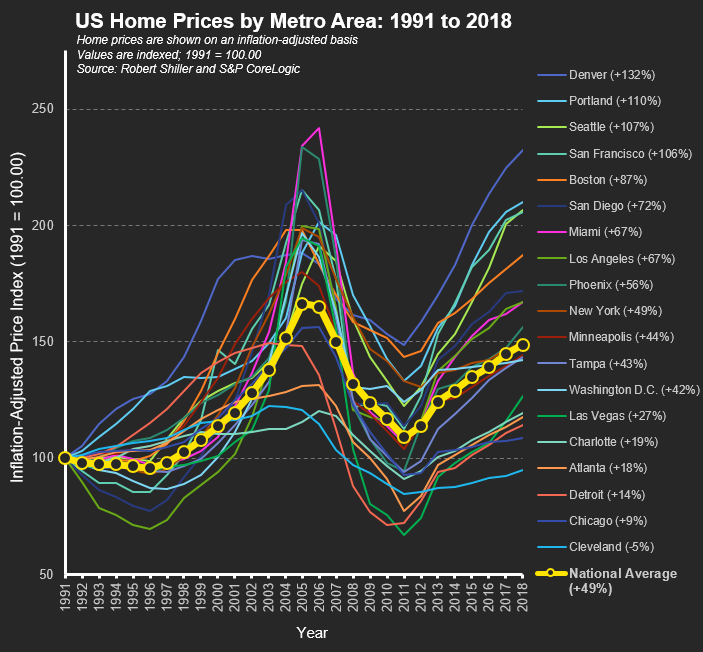
In the animation below, you’ll see how home prices in each of the 19 U.S. cities changed on a year-by-year basis. A more complex picture emerges…
From the early 1990s to the mid-2000s, home prices shot up fast & furiously.
However, the trend reversed suddenly in 2005-2006. It became evident that home prices were being propped up by speculation, Wall Street greed, and by massive loans doled out to people with no chance of paying them back (typically of the no job / no income / no assets variety).
Over the next 5 years, the great recession was in full swing. Home prices across the country were in free-fall.
Miami is a prime (or subprime?) example of this, where home prices increased by 142% from 1991 to 2006, followed immediately by a decline of 56% from 2006 to 2011.
From the market bottom in 2011, most cities have begun to recover, although not quite to their pre-recession levels. On a national average basis, home prices are still ~10% below the peak of 2005.
Down below, you’ll find the same chart, but this time presented as a static image which has been frozen on the final frame.
A History of Home Prices in Canada
Shifting our attention north of the border, we’ll now walk through a history of home prices in Canada.
This data has been sourced from the Teranet-National Bank home price index, calculated through the same repeat-sales home methodology that was used for the U.S. analysis. Once again, the data is based on the prices of single-family homes.
Unfortunately, the Canadian data-set only covers the period of 1999 to 2018 — 19 years in total. This makes the Canadian data-set roughly one hundred years smaller than the U.S. data we saw previously.
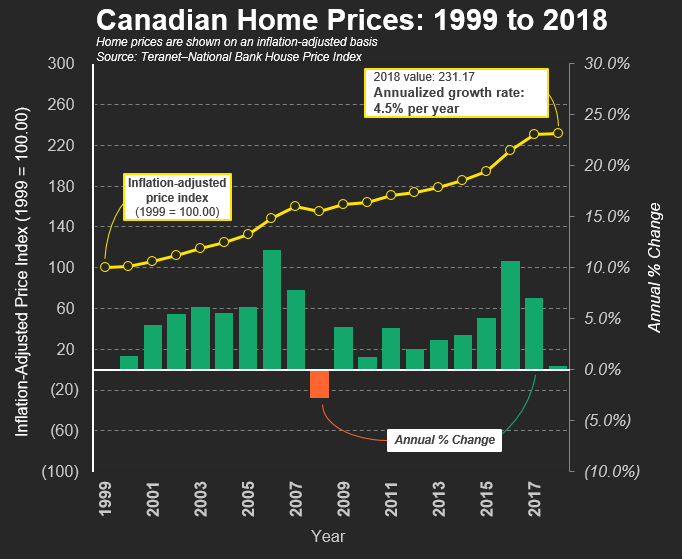
The Canadian real estate picture has been far rosier. Aside from a brief negative blip in 2008 (when prices were down by 2.7%), the trend has been up, up, and up again.
From 1999 to 2018, home prices in Canada have increased by a total of 131%, or 4.5% per year on an annualized basis.
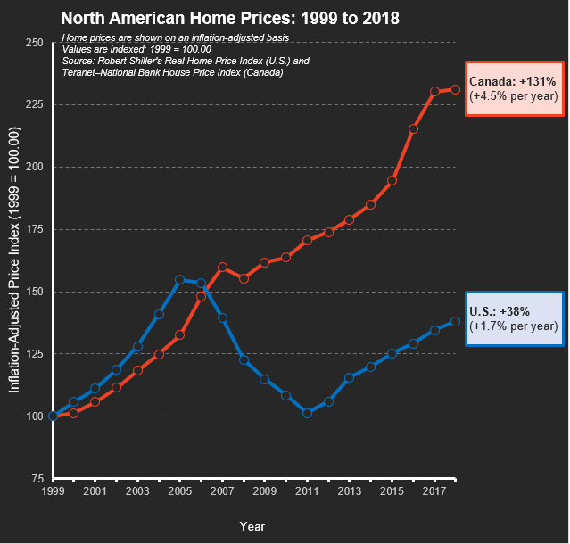
Pairing up the Canadian data with the U.S. data over the same time period, we see a tale of two divergent paths.
Home prices in Canada and the U.S. moved upwards in lock-step from 1999 to 2005. However, while U.S. home prices began to tank during the great recession, Canadian prices continued their steep climb.
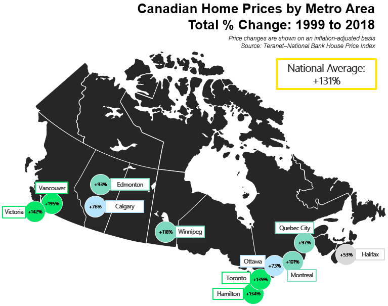
Breaking it down to a city-by-city level, we can see the largest percentage price increases in Vancouver, Victoria, Toronto, and Hamilton.
Meanwhile, prices have remained much flatter in Halifax, Ottawa, and Calgary.
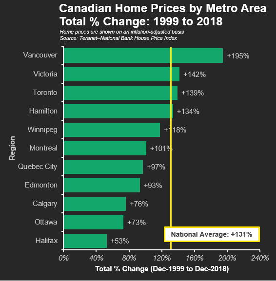
Through the 19 years on record, prices in Vancouver have risen by 195%, compared to a national average of 131%, and only 53% in Halifax.
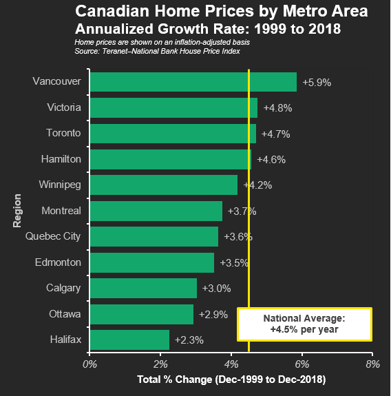
On an annualized basis, home prices in most Canadian cities have increased by ~3% to 5% per year.
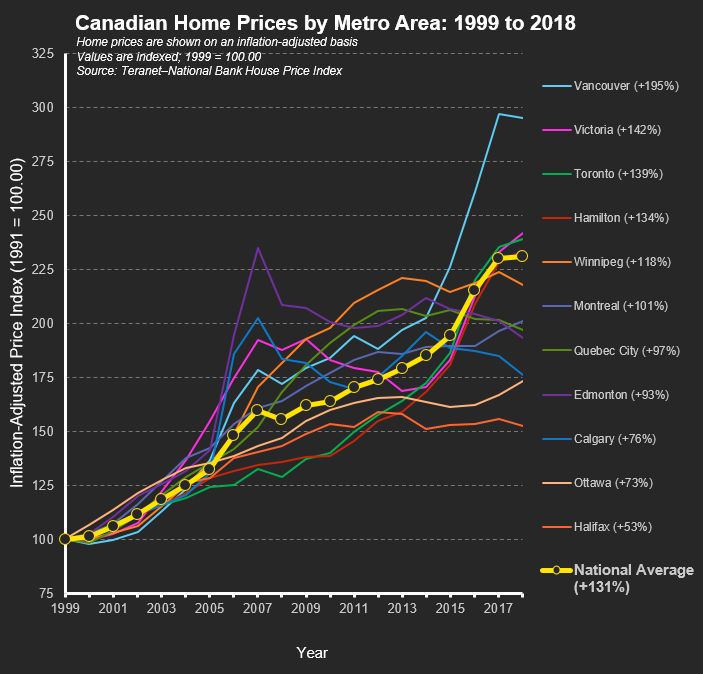
Flipping to the full year-by-year detail, the trend by city is mostly up and up.
In particular, prices in Vancouver have been on a tear since 2014 (rising by 45% from 2014 to 2018). Of course, none of this will be news to residents of Vancouver, who by now are tired of seeing decidedly average properties sell at eye-popping prices.
However, home prices in Edmonton and Calgary have bucked the national trend. Those two Albertan cities had big price increases from 1999 to 2007, followed by declining home prices over the next decade — generally mirroring the price of oil, which drives much of the provincial economy.
For example, home prices in Edmonton (the purple line in the chart above) rose by 135% from 1999 to 2007, before falling by 18% from 2007 to 2018.
Overall, the history of home prices in Canada has been extremely favourable to home-owners and investors. Time will tell if the trend carries on, or if those crying bubble will be proven right.
Final Thoughts
Mark Twain famously said: “Buy land, they’re not making it anymore.”
There’s a good reason I turn to famous authors for bedtime reading instead of financial advice.
As this history of home prices has shown, there’s a lot more nuance to real estate investing than is often believed.
Over the long term, home prices (at least in the U.S.) have performed just slightly better than the rate of inflation. Home prices can (and do) go down. And each local market has a character and investment profile of its own.
Before you go out on a whim and buy a home — arguably the most important financial decision of your life, I’d encourage you to consider a scenario where the home doesn’t appreciate in value, even in the long-term.
If the numbers still check out, you can be confident that you’ve prepared for the worst, and resume hoping for the best.
Related Reading & Resources
- U.S. stock market returns — 1870s to present
- Rent vs buy calculator (helping you crunch the numbers and figure out if you’re better off buying a home, or instead investing your cash in the markets)
For my fellow data-heads: here’s a link to download a spreadsheet containing all of the data used in this post.
—
Header image credit: Giacomo Bagnara
Comment Section
Be the first to write a comment.